Archive

Illustration

“tereshkova” by Philip Bond / Flickr

Comic artist Philip Bond’s illustrated “portraits” of female astronauts are amazing. He describes how he started the project:

Working for months at a time just penciling a comic book I started these portraits to get a bit of inking and colouring out of my system. I shouldn’t say ‘portraits’, I’m not going for much of a likeness. Usually I’ll glance at a couple of photographs and then go off and draw a vague impression. Margaret Seddon is blonde, Judith Resnik is a bit barmy looking, that sort of thing.

“astronauts” by Philip Bond on Flickr

The 2012 Warby Parker Annual Report

The 2012 Warby Parker Annual Report

Working in advertising, I sign up for a wide array of competitor emails to keep an eye on trends, interesting strategies and clever ideas. A lot of these emails slip right by me (I can rack up close to 200 in a week if I forget to clear my inbox) but sometimes they’ll catch my attention – and some, like this one from eyeglasses retailer Warby Parker, I just have to share.

Warby Parker is a boutique eyewear retailer that offers stylish eyeglasses at just $95 a pop. It sounds like there might not be a lot to that story, but Warby Parker really differentiates itself with a strong, fun brand. The copy on their site is clever, the photography is clean and interesting, the design is sleek and simple, and their social media presence is very strong.

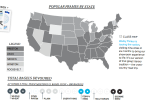
The email I got yesterday caught my eye because it doesn’t do any selling – it just directs customers to this interactive “Annual Report,” which tells the story of Warby Parker’s year through data like:

  • Average number of false fire alarms per week (2)
  • Office lunches by the pound
  • Number of monocles sold (296)
  • Total bagels devoured at weekly full-team meetings

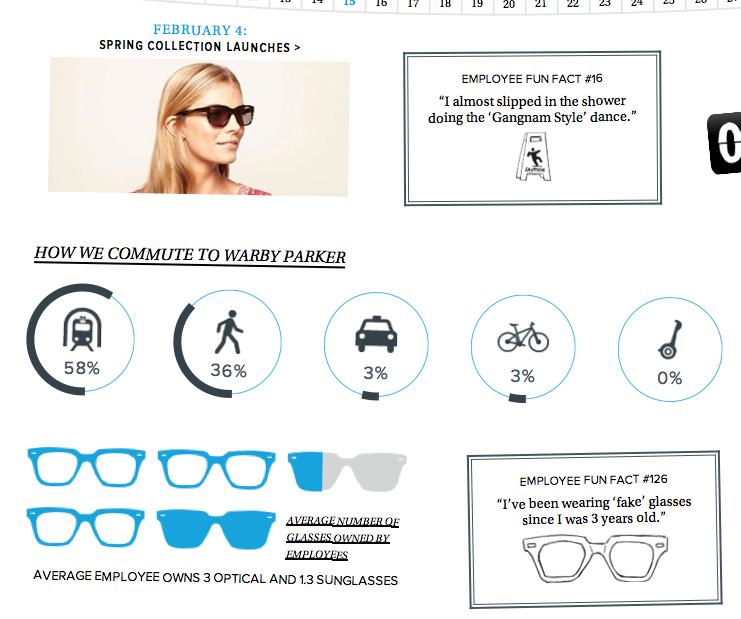
I’m posted a few more shots below showcasing the great design and graphics that illustrate the report, but do yourself a favor and read the whole thing. Maybe it will even make you want to buy some glasses.

The  2012 Warby Parker Annual Report

Picture 8Picture 5Picture 7

Don't text or check your phone when speaking with others. Give Your Full Attention. Ted Slampyak, The Art of Manliness

Poster Illustrated by Ted Slampyak (The Art of Manliness)

The Art of Manliness has created half a dozen faux “propaganda posters” to lay out some of the simple rules of modern etiquette:

During the 1920s, 30s, and 40s, the use of “propaganda posters” were popular for encouraging good behavior — teaching safety, boosting worker morale, and rousing wartime sacrifice. I’ve always enjoyed the art and design of these posters, and decided to have Ted whip up a set of originals to address an area of behavior where modern society is often lacking: smartphone etiquette.

Come to think of it, maybe it’s not right to call these “faux” posters after all – a number of commenters are planning to print them out and start plastering.

“I Want You… To Put Away Your Smartphone: Propaganda Posters for the Modern Age” on The Art of Manliness